At the start of the year, I contributed an essay to Sukanya Deb’s culture and criticism magazine Purée Mag. I wrote about what I’ve learned from the efforts I make to document street lettering in India, and organising and re-organising what I gather. Leaving a couple of snippets from the piece below, but I hope you’ll read the full text and also check out this wonderful article in the magazine about Tek Bir Mukhiya’s typographic and lettering works by Bishal Yonjan.
❝It is my belief that good design always finds a foothold in the cultural continuum of a region and community. Whether it is building on familiar visual cues or subverting them, it can only be done authentically when one has a grasp of local design paradigms, both past and present. This is easier said than done, because in India, design histories are often poorly recorded and articulated.❞
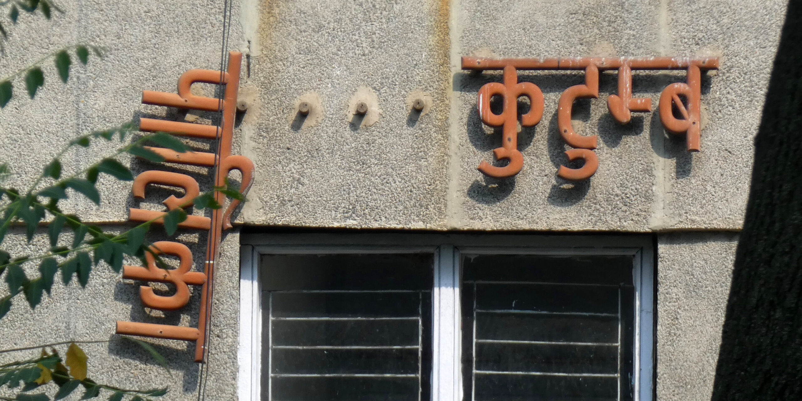
❝Despite the increasing proliferation of digitally-printed flex, many sign boards are still replete with Indic script letterforms that are crafted using non-digital tools such as a paint brush, or in materials like wood, metal, tile, plaster or neon. That makes them an invaluable typographic resource because they contain the possibility of circumventing the functional limitations of mainstream printing and typesetting technologies, while offering ways to imagine letterforms in a way that may be absent from canonical representations in type.❞
Since you’re here, I have one more request: if you can, please support the Kickstarter campaign that Blaft Publications is running to crowdfund my upcoming book, India Street Lettering: A Journey through Typographic Craft & Culture. We’ve reached our target, but you can still pre-book your copy and get your hands on some fun goodies.